I’ve Been Using iOS 26 for a Week: Bold, Blurry, and Kinda Brilliant
If you’ve been on social media after the latest WWDC, you were probably swarmed for a week with posts—some geeking out over Apple’s new design system, others making fun of it.
While cool and slick in some respects, it also comes across as a bit pretentious and goofy—not to mention a potential accessibility nightmare.
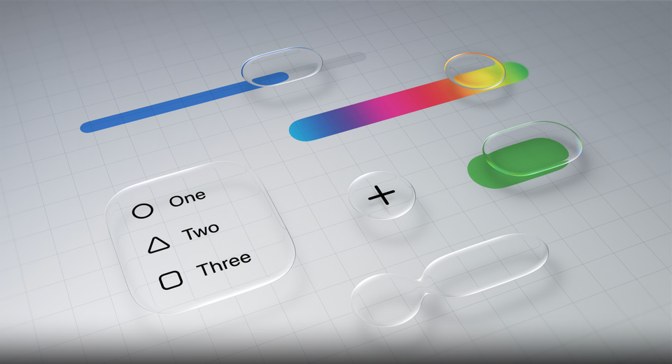
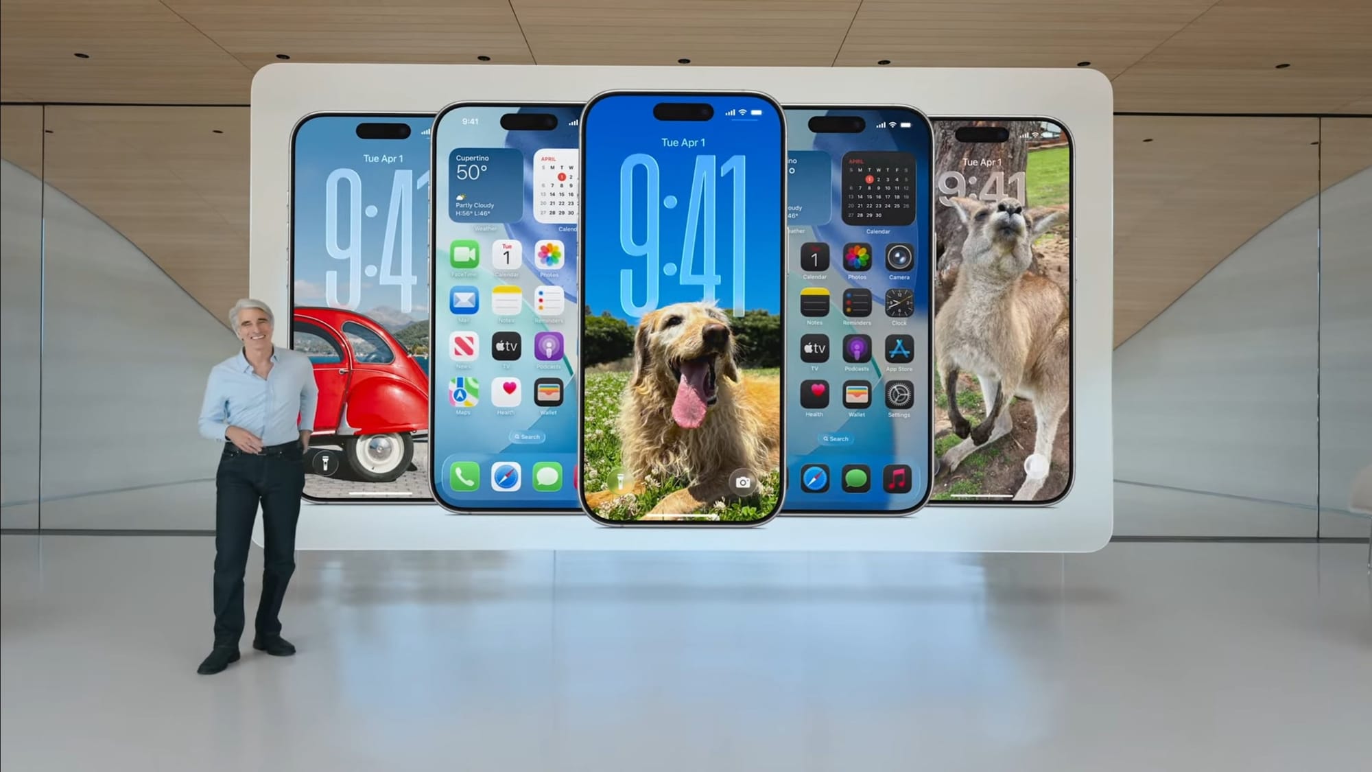
There are moments while using iOS 26 that feel like magic. The new homescreen options are beautiful and dynamic, and the way the new components refract light is truly amazing to see and experience...
but...
Liquid Glass does make the text hard to read sometimes, which seems counterintuitive to Apple’s traditional focus on accessibility and UX design.
What’s cool about Liquid Glass isn’t the design itself per se, but the fact that Apple is finally bringing a cohesive, unified design language to all of their devices and platforms in a way they’ve never done before.
The Liquid Glass App Icon Style: A Misstep?
While I generally find the idea of the Liquid Glass design philosophy fascinating, its practical application leaves a little to be desired.
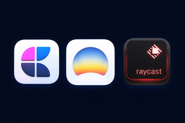
Take the new app icon logos, for instance. The goal was to add dimensionality and depth, moving past the previous iteration of flat, minimalist icons.
Now, the apps have depth and transparency layered into them. This is beautiful when inspecting closely, but from a distance, it makes the apps—and by extension, the homescreen—look blurry.
I’m sure I’ll get used to this blurry effect over time. But for now, especially since not all apps have adopted the new style, it feels particularly jarring.
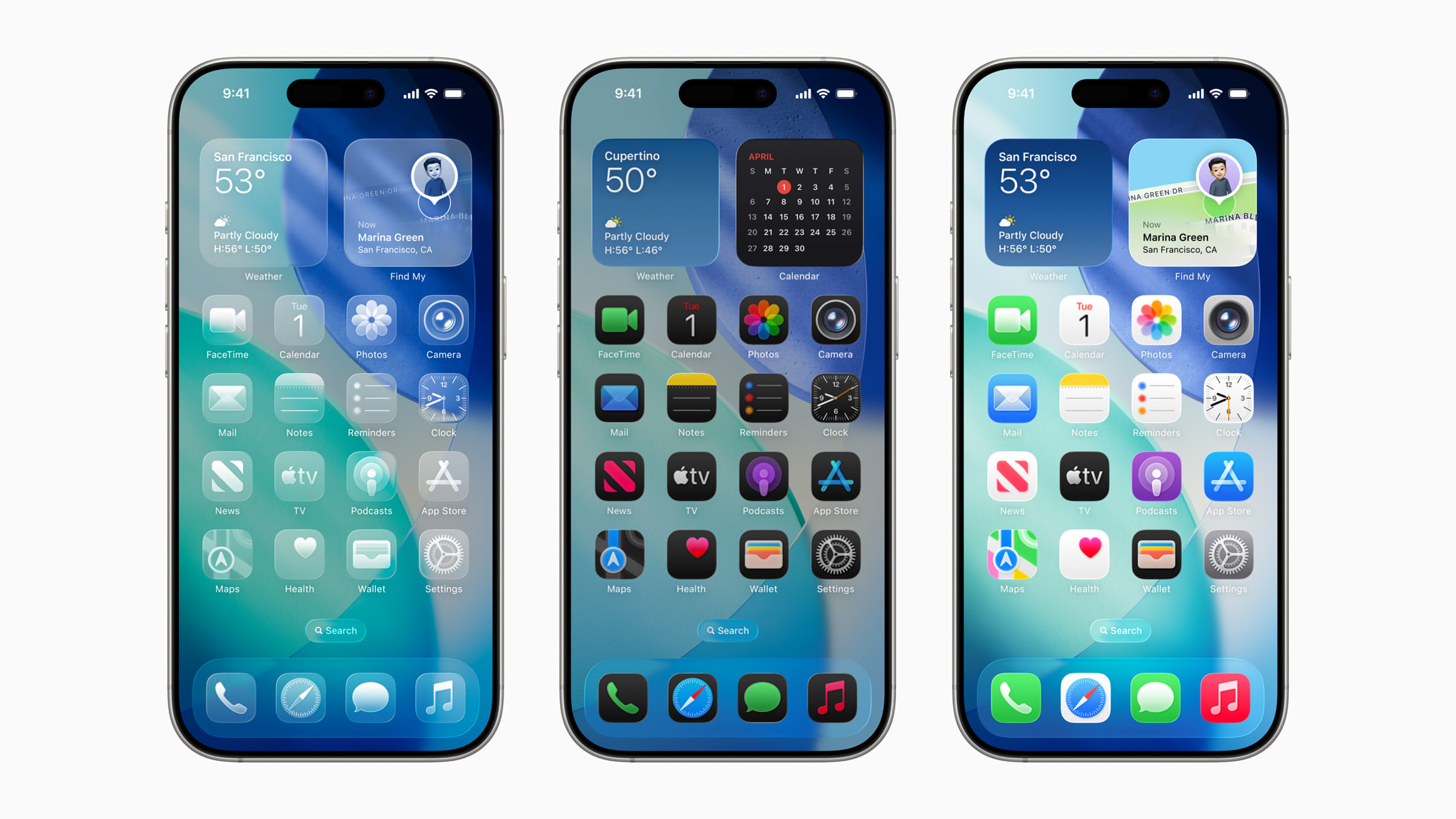
Not only do the icons not match each other, making the homescreen look chaotic, but the new, blurrier updates clash with their sharp, flat-designed counterparts.
The whole thing comes across as messy—when clarity should be prioritized above all else.
As I’ll say multiple times: hopefully, when the full release comes out and most app icons are updated, I’ll come to appreciate the new design more. But for now, the new approach definitely leaves something to be desired.
Navigation Improvements Across Apps
Putting the aesthetics of Liquid Glass aside for a moment, one of the best things this redesign has done is allow Apple to greatly enhance the navigation systems in their native apps—something they should have done years ago.
For a long time, Apple’s old design language just wasn’t robust or accessible enough to support the growing number of apps in their ecosystem.
In short, the magic of Apple’s earlier design simply wasn’t cutting it anymore, especially as their technologies and platforms have inched closer to a unified experience.
Take Safari, for example. I’m still an Arc browser fanatic, so I’m not switching anytime soon—but the new updates make Safari so much easier to use.
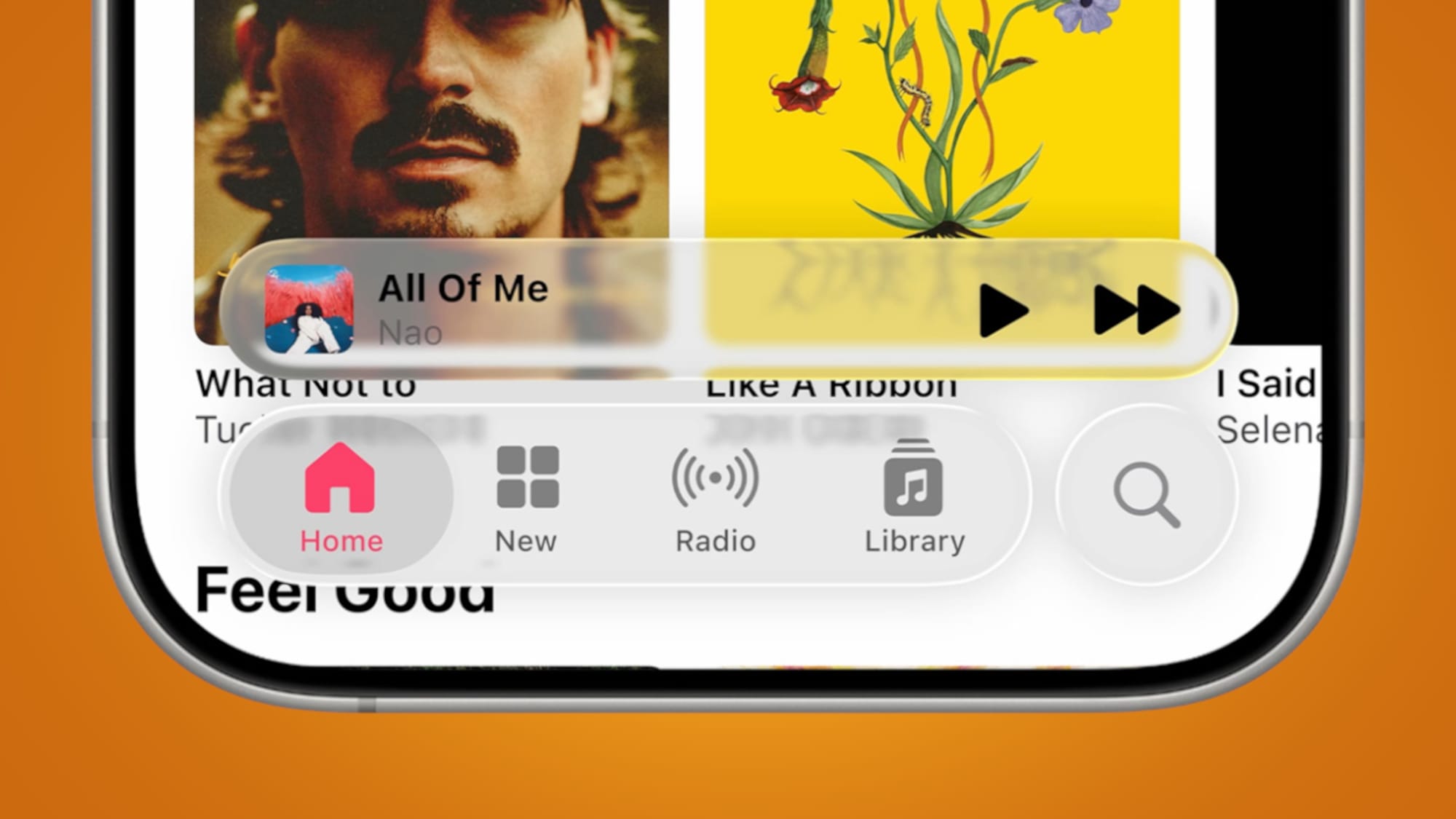
Apple has wisely prioritized placing the search bar, navigation buttons, and controls at the bottom of the screen instead of the top.
And now, they’ve applied this new navigation model to many more apps, making navigating and searching far easier and more accessible than ever before.
But alas, not every app received the same treatment—most notably, the Reminders app.
While researching to-do apps, I noticed that powerful options like Todoist shine because they use bottom navigation, with Today as the default home screen.
I had hoped Apple would take a cue from Todoist and apply a similar layout—especially after the much-needed refresh of the Photos app. But no such luck, I’m afraid.
Maybe they’ll improve the Reminders app’s navigation before the final release, but I doubt it.
Summary
With all that being said, here are my key takeaways from the Liquid Glass experience so far:
The Good
- Navigation is generally better across all apps.
- Specifically, updates to the Photos and Safari apps make them so much easier to use and navigate for core functions.
- Nice little touches, like larger alarm clock notifications, improve usability.
- More options to customize your homescreen—which is cool.
The Bad
- The new Liquid Glass app icon style makes everything look blurry, which feels like the opposite of what Apple intended.
- Unlike the updated Photos app, the Reminders app is still behind. A bottom navigation with quick access to Today would make it far more functional.
- General readability and accessibility have taken a hit.
My overall thoughts? Liquid Glass is cool and all, but mostly unnecessary.
The truly useful updates come from improved navigation—and those could’ve happened without the Liquid Glass layer.
To make matters worse, the opacity of Liquid Glass often makes text or icons hard to read. Combine that with the blurry app icons, and the whole experience feels slightly unpolished.
Obviously, Apple is future-proofing for AR. They’re not doing Liquid Glass because it’s the best experience for phones and computers today. They’re doing it because of where they believe the future is headed—and they want a unified experience ready for that future.
Which is cool to think about... but it does feel a little off that they’re rolling out these updates now—when it almost doesn’t make sense to do so quite yet.
Sign Up for My Newsletter & Explore
If you enjoyed this article, consider signing up for my newsletter for more insights, updates, and behind-the-scenes content — you can join here. And if you're curious about the stories I write, head over to my store to check out my books.
Thanks for reading!